Using Scatter Diagrams to Their Max Potential
“Simplicity boils down to two steps:
Identify the essential.
Eliminate the rest.” — Leo Babauta
I remember when I first started creating reports for work I would want to show off my skills by throwing in a variety of graphs and charts. My thought was to maximize my reports and presentations by presenting every data point at every angle, including as many details to a single graph as possible. I cringe at the thought now. I learned overtime that there’s a correct situation for every graph, and that less is more when it comes to efficiently conveying a story with your data. This is the information I want to share with you today.
Whether you are an expert or a novice, I believe this article will be a great resource to anyone wanting to sharpen or refresh their knowledge on graphing. In this article I want to go over the following:
When to Use a Scatter Diagram
How to Represent the Data Within a Scatter Diagram
Understanding and Explaining your Scatter Diagram
Going through these sections my goal is to help you identify the unnecessary fluff and noise, present a simple, straightforward story for your audience, all while trying to avoid getting too technical.
When to Use a Scatter Diagram
A scatter diagram is primarily used when you want to determine if a pair of numerical data points have a cause-and-effect relationship with each other. A scatter diagram is effective at showing a relationship because it does a good job of showing the range of data points at any section. If we were to use a bar or line chart, the best we could derive would be the trend of the data. We would miss out on a lot of other potential insights. Let’s look at an example:
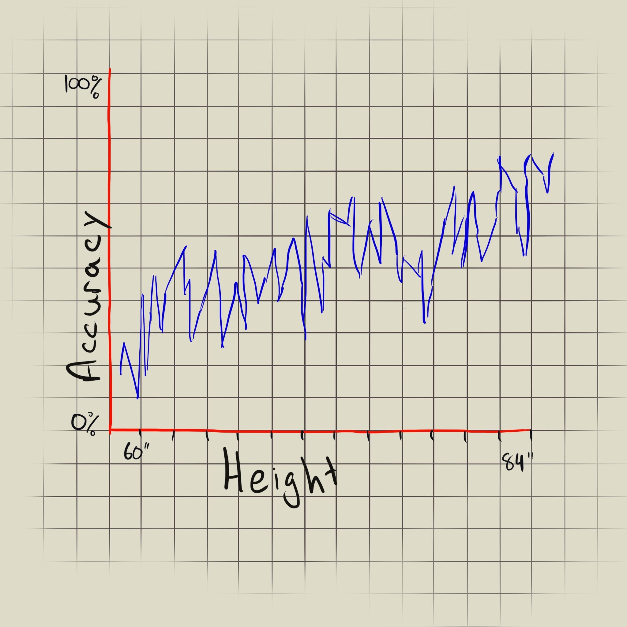
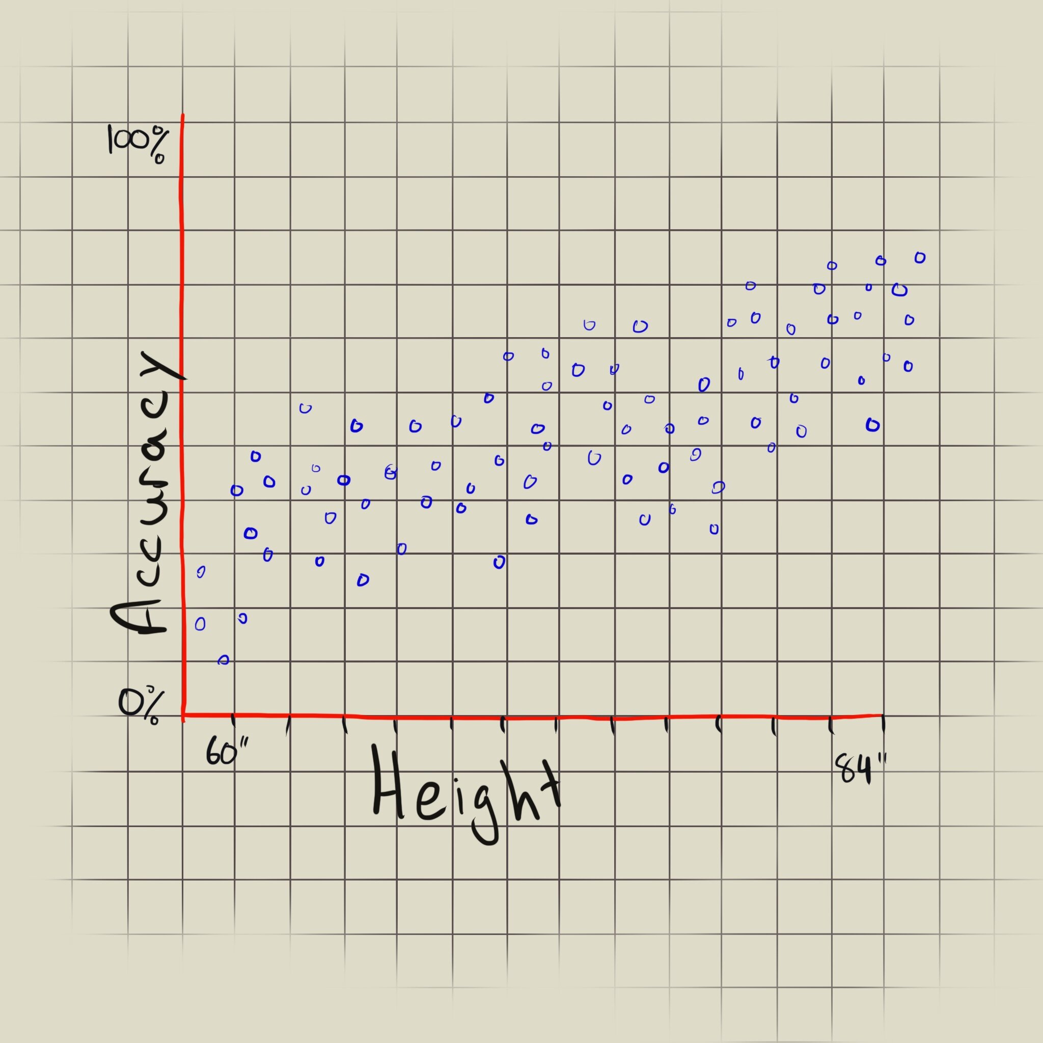
The graphs here represent the same data points, but represented as a line chart and a scatter diagram (ignore my inability to draw straight lines). The data points are made up. They do not represent actual data from any conducted research.
Let’s assume we have a set of data of archers and their heights and shooting accuracy. If we use the data to draw a line chart, we can see that there’s a positive trend between height and accuracy: the taller the archer the more accurate their shots. But the line’s direction gives us no additional meaning, and makes the graph a lot more confusing. A line between two points generally represents a change over an interval (usually time), not other numerical values. If we plot the data into a scatter diagram format, we can see the trend between the height and accuracy pairs, and properly see the range of values. If the data points did not have a trend, then the line chart would not give us any information at all. We’d just see a spaghetti-like mess, and the only time that’s acceptable is when you’re a toddler throwing a tantrum.
Here are some questions you can ask yourself to determine if you should use a scatter diagram or not:
Does my data need to be represented over time?
Does my data need to be aggregated (taking an average or sum of the data)
Does my data have less than two non-date/time variables?
If you answered no to all three questions, then using a scatter diagram should be just fine.
So when comparing between two variables (where one is not time) it is best to represent the data in a scatter diagram for ease of readability and analysis.
How to Represent the Data Within a Scatter Diagram
Now that we know when to use a scatter diagram, let’s spend some time to determine how to best represent our diagram. Depending on the results of the scatter diagram, we can focus on telling a specific story or finding. Below are ways we can highlight our findings.
Trend Lines
A trend line is a great way to show what kind of relationship our data pairs have. Does the data show a positive or negative correlation? How strong is the correlation between the data pairs?
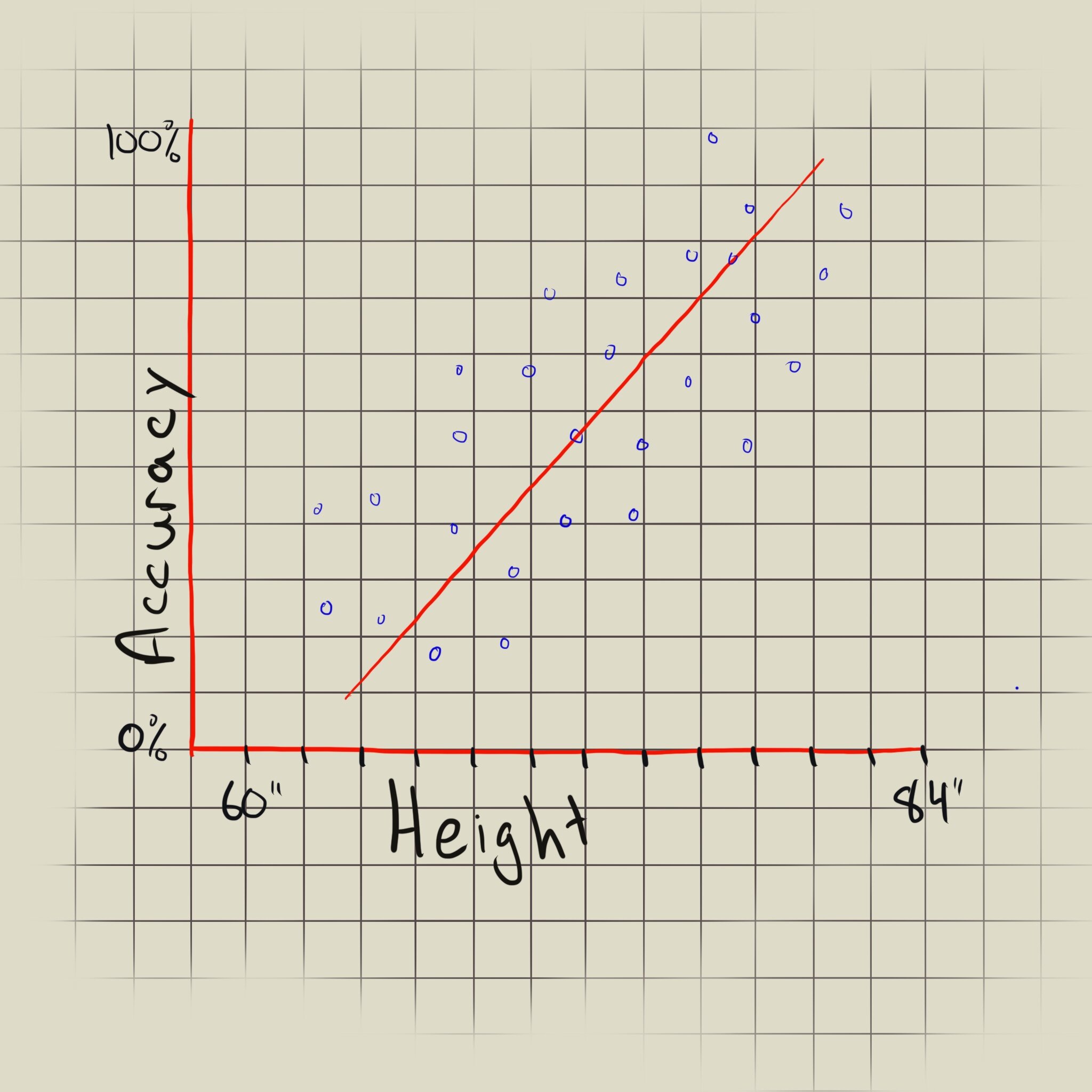
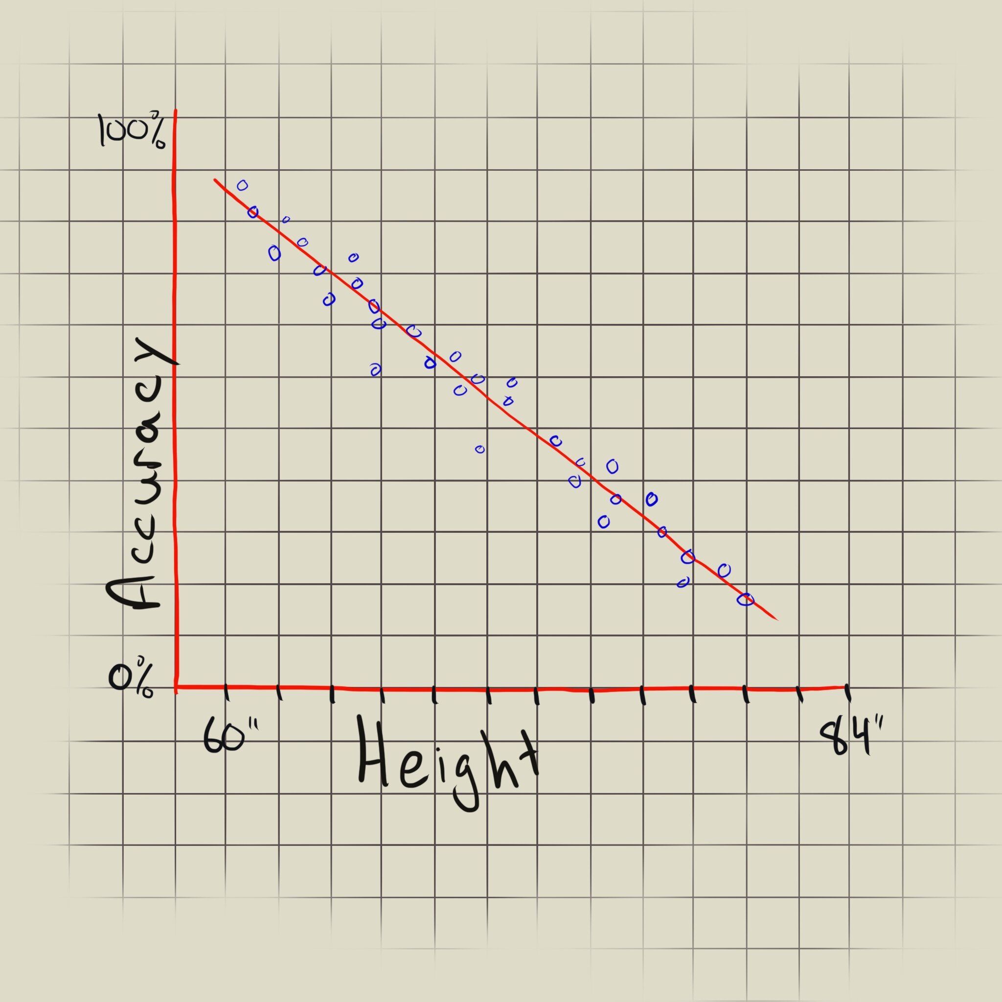
Positive or negative correlation? The graph on the left shows a positive correlation between height and accuracy, whereas the graph on the left shows a negative correlation.
Looking at the diagram to the left we can see that the trend line slopes upwards, showing a positive correlation between the archer’s height and accuracy, but the points are pretty far from the trend line, representing a weak correlation. In contrast, the diagram to the right shows the data points sloping downward and close to the trend line, indicating a strong negative correlation.
The slope also tells us if the trend line is completely horizontal or vertical. A horizontal trend line indicates that the variable on the x-axis does not affect the variable on the y-axis, whereas a vertical trend line tells us that the x-axis variable is unrelated to the y-axis variable. The two results are interchangeable as we can set the x- and y-axis as either variable.
Using trend lines, we can more easily explain the nature of the data that we plot. I’ve added more succinct definitions of what the trend line can tell us below:
Trend line slope: The steepness of the trend line tells us that the rate of change in the y-axis is caused by the x-axis. An upward or downward slope from the origin represents a positive or negative trend, respectively. A completely horizontal trend line represents no change in the y-axis that is dependent on the variable in the x-axis. A vertical trend line would show that the changes in the y-axis are caused by some other variable than what is used in the x-axis.
Density of data to the trend line: Density to the trend line tells us how dependent the variables are to each other. If the data points are close to the trend lines, they are very dependent. A lower density (data points further from the trend line) would represent that other factors are probably associated with the y- or x-axis.
Curvature of the trend line: A straight trend line represents a constant ratio change: for every value in x a defined value in y will change. If we see a curved trend line (parabolic curve), then the rate of change could be accelerating or decelerating along the x-axis.
If you need more details, below is a great resource with more information about trend lines and how to understand their slopes and it’s general use in coordinate geometry:

Slope of a line
(Coordinate Geomtery)
www.mathopenref.com
Coupling the trend line with sections of the diagram can help us tell an even more specific story about our data.
Cross Sections
Depending on the story we’re trying to tell our audience, we can focus on certain parts of our scatter diagram. It’s usually a good idea to start out with a general explanation of your data and then to do a deeper dive. This helps your audience follow along and engage with the story.

Creating sections of your scatter will help draw your audiences eye’s to the information relevant to your story.
From the graph above we can distinguish two characteristics of our data on the archers:
Archers between 5' 4" and 5' 6" on average have lower-than-average accuracy. We can make this inference as the majority of the data points within that range are below the trend line.
Archers between 6' and 6' 8" tend to be the average height and accuracy. We see the majority of the data points clustered around this area, representing the mean.
Sectioning off areas of the scatter diagram is a great way to focus on the mean, above/below averages rates, and even anomalies to the data set. Using this technique will really help us guide our audience through the story we’re trying to tell.
Circling Clusters
When we plot our scatter diagram we won’t necessarily generate a graph with an obvious trend line, but that doesn’t mean we can’t derive insights from our data. As we’ve discussed in the trend line section, we can have a scatter diagram where the trend line could be vertical or horizontal. See below:

Again, this diagram was not constructed with any factual data. Its purpose is to illustrate a point. Specifically, to illustrate many points! (Pun absolutely intended).
Here we have a different data set (finally, I was getting sick of the archers’ data as well). On the x-axis we have the average length of words used by writers, and on the y-axis the years of experience they have. Let’s see what we can tell from this data set by circling the clusters of data points.

Yes, I do realize that I said scatter plots should not be used with time intervals, but in this scenario, years isn’t used as a continuous time interval. The years is a quantitative measure of how much experience an individual has, not how much time has passed.
Looking at the circled data in the above chart, it seems like writers with a few years of writing experience, as well as writers with more years of writing experience, tend to use shorter words. On the other hand, writers within the median writing experience range use longer words. The story we could tell from this is:
New writers have a smaller/simpler vocabulary, therefore word length is shorter. As writers become more experienced, vocabulary expands and longer words are used. The most experienced writers will go back to using shorter words, as experience has taught them that ease of readability makes for better writing and for reaching a broader audience.
We don’t need to look for a trend to determine a pattern. We can focus on clusters or anomalies to see if we can make sense of the data, or where to focus our investigations next.
Understanding and Explaining your Scatter Diagram
We spent a good amount of time discussing different ways to interpret and present our data, but it’s just as important to know how to truly understand and explain what your data is presenting. It’s easy to make biased assumptions from a scatter plot, so let’s go through a few potential pitfalls and see how we can avoid making them.
Ensuring Sample is Representative of the Population
Our scatter plot will rarely, if ever, contain the entire population that we are trying to consider. Different factors including our own biases can affect how we’ve sampled data. Google News is a good example of this in action. Depending on your past search history, Google will surface “relevant” news topics and ads to you, but these topics and ads are not indicative of the entire population, it’s only the spectrum in which you are interested.
If you’d like to learn more about how to have Google News surface unbiased articles, you can check out my earlier Medium post here:

Using Google News for Unbiased Information
Why it Matters
Let’s take a look at the diagram below to take a deeper dive at this phenomenon.

A diagram which represents the even distribution between wealth and cat/dog lovers. (This is a friend zone I wouldn’t mind being in).
Let’s assume that we live in a world where there is no correlation between wealth and whether someone is more of a dog lover or cat lover. In this world the fact is that there are just as many wealthy dog lovers as there are not-so-wealthy dog lovers, and the same goes for cats — an evenly-distributed population. Now let’s assume you primarily hang out with wealthy cat owners. If you created a scatter diagram based on a survey of people you spend time with, you’d incorrectly see a correlation between people who love cats and higher wealth. You’d be missing out on surveying the hardcore dog lovers, and people of a lower wealth standing.
Here’s another example: you sent an email blast to all 1,000 of your subscribers about a new product for sale. 100 of your subscribers bought the product. 60 of them live in Ohio, and the remaining 40 in other states. You could use the 100, and determine: “Wow, Ohioans in particular really enjoy my product!” Now let’s say 800 of your 1,000 subscribers are from Ohio. This changes the story now, doesn’t it? You just marketed to more Ohioans than people from any other state. Ohioans don’t necessarily like your product, only 7.5% of them bought your product. On the other hand 20% of non-Ohioans also bought your product. (but the Ohioans like you enough to subscribe to you, though).
To ensure that you have a good sample set, make sure that the data you are using is truly representative of the insight you are trying to portray. A good exercise is to:
Make a note of what behavior or activity it is that you are trying to evaluate.
Determine what are all the variables that would need to be considered to make that evaluation.
Check if your current sampling method was thorough enough to include the variables determined in Step 2.
Correlations are not always Transitive
If all Bobs are builders, and all builders can fix-it, can all Bobs fix-it? Yes they can. Because being able to “fix-it” is a transitive correlation of Bobs. But in this instance the key word is all. We made a very generalized statement. If we said if all Bobs are builders, and some builders can fix-it, then not all Bobs can fix-it.
Everyone is getting a gritty reboot these days…smh
So when we are making multiple scatter diagrams, we have to be careful not to not assume that different correlations and their variables are related to each other. They are not always transitive.
Here’s a more non-SAT style scenario. Let’s assume we plot two diagrams:
Hours of sleep plotted against number of productive hours
Number of productive hours plotted against number of articles written within a day.
If both diagrams show a positive correlation of each of the variables, then it seems logical to say that “An individual who sleeps more can write more articles in a given day.” This could be true, but we cannot deduce this conclusion. We don’t know if the correlations are transitive. It could be that a person writes more articles because they had a carb-heavy breakfast which fueled their brain. We don’t really know. So it’s best to avoid these kind of comparisons, unless we can prove the correlation are transitive. If you can take the time to prove the transitivity exists, it may be worthwhile to add those details.

This is honestly one of my favorite diagrams to draw during a meeting. (Feel free to use it for the “smartest guy in the room” award. I know I’m guilty pulling this out for the very same reason).
Let’s use the above graph to illustrate the example. This includes some multi-dimensional graphing which we won’t get into here (resources on understanding this at the bottom of the article). Suffice it to say that ‘x’ is a vector that represents all hours of sleep taken by our sample, and ‘y’ is a vector that represents all productive hours by our same sample, and that ‘z’ is a vector that represents all articles written by, again, the same sample. Vectors with less than a 90-degree difference between them are said to be correlated as they are in general moving in the same direction. So those are vectors ‘x’ and ‘y’, and ‘y’ and ‘z’. If we look at vectors ‘x’ and ‘z’ they have a greater than 90-degree difference, showing that the two vectors are not correlated.
So why go through the hassle of explaining this? Because, as the storyteller, it is your job to guide your audience, and help them avoid misunderstandings about your findings. I’ve personally found using the vector example on a whiteboard extremely helpful in explaining this concept. A lot of businesses will make decisions based on these findings, so it’s important to ensure that we help them make the best and most accurate ones possible.
Determining the Chicken-or-the-Egg Problem
We’ve learned a lot about what kind of inferences we can make from the scatter diagrams we’ve made, but we need to still determine which came first, the chicken or the egg?
We’ve seen a positive correlation between an archer’s height and their accuracy, but are archers who are taller more accurate or do archers who shoot with accuracy become taller? It may sound like a ridiculous question to pose, but it’s a point you have to prove one way or another.
Here’s a more ambiguous example. Let’s assume there is a correlation between children who throw tantrums more than the average child, and poor grades at school. Which is the cause, and which is the effect? Do poor grades make children throw more tantrums, or do kids who throw tantrums tend to produce poorer grades? Chicken or egg?
A good way to isolate correlated results, or as I like to say, “the quick and dirty method”, is to create more diagrams that are possible factors. Can we check for how nutrition affects grades? Can we also check if single- or two-parent homes make a difference? There’s a lot of back-and-forth that can occur, but it’s up to us as the storyteller to determine the truth before we represent it to our audiences.
As you can see there’s a lot we can do, and even more to consider when creating scatter diagrams. To help boil them down, keep the following questions in mind the next time you’re creating a scatter diagram:
What story or recommendation am I trying to present to my audience?
Is using a scatter diagram the best way to represent my data?
What is my trend line telling me about my plotted data? Or are there any other patterns that emerge?
Is my data set indicative of the entire population?
Am I properly correlating my findings?
Did I take enough steps to determine the true cause-and-effect nature?
Going through these steps will help you identify the most important and relevant aspects of your data, and present them appropriately. Since we also went through some mental exercises on how to think about your findings, you’ll be able to confidently speak to your audience in a presentation setting.
If you enjoyed learning about scatter diagrams and the thought that can go into it, I would highly recommend reading Jordan Ellenberg’s book “How Not to Be Wrong: The Power of Mathematical Thinking”.
It has been my favorite read of 2019, and there are a lot of great concepts you can learn from it and apply to your day-to-day work. Part 4 of the book, Regressions, has a lot of great detail on how to look at data conceptually and what meaning you can actually derive from it. Great use of scatter diagrams in that section of the book. It also contains a lot of other easy to understand and powerful to use mathematical concepts. (The above link is an affiliate link, and I may be compensated with commission for sales made through the link).
I love receiving feedback on my work, so feel free to comment or send me a message. If you have any questions or need clarification on anything I’ve written feel free to send me a message here. I’d be more than happy to help however I can!
Happy learning!